| Year | Gender | Smoke | Exercise | TV | Height | Weight | Siblings | BirthOrder | GPA | Pulse |
|---|---|---|---|---|---|---|---|---|---|---|
| Senior | M | No | 10 | 1 | 71 | 180 | 4 | 4 | 3.13 | 54 |
| Sophomore | F | Yes | 4 | 7 | 66 | 120 | 2 | 2 | 2.50 | 66 |
| FirstYear | M | No | 14 | 5 | 72 | 208 | 2 | 1 | 2.55 | 130 |
| Junior | M | No | 3 | 1 | 63 | 110 | 1 | 1 | 3.10 | 78 |
| Sophomore | F | No | 3 | 3 | 65 | 150 | 1 | 1 | 2.70 | 40 |
| Sophomore | F | No | 5 | 4 | 65 | 114 | 2 | 2 | 3.20 | 80 |
| FirstYear | F | No | 10 | 10 | 66 | 128 | 1 | 1 | 2.77 | 94 |
| Sophomore | M | No | 13 | 8 | 74 | 235 | 1 | 1 | 3.30 | 77 |
| Junior | F | No | 3 | 6 | 61 | NA | 2 | 2 | 2.80 | 60 |
| FirstYear | F | No | 12 | 1 | 60 | 115 | 7 | 8 | 3.70 | 94 |
Describing Variables
STAT 120
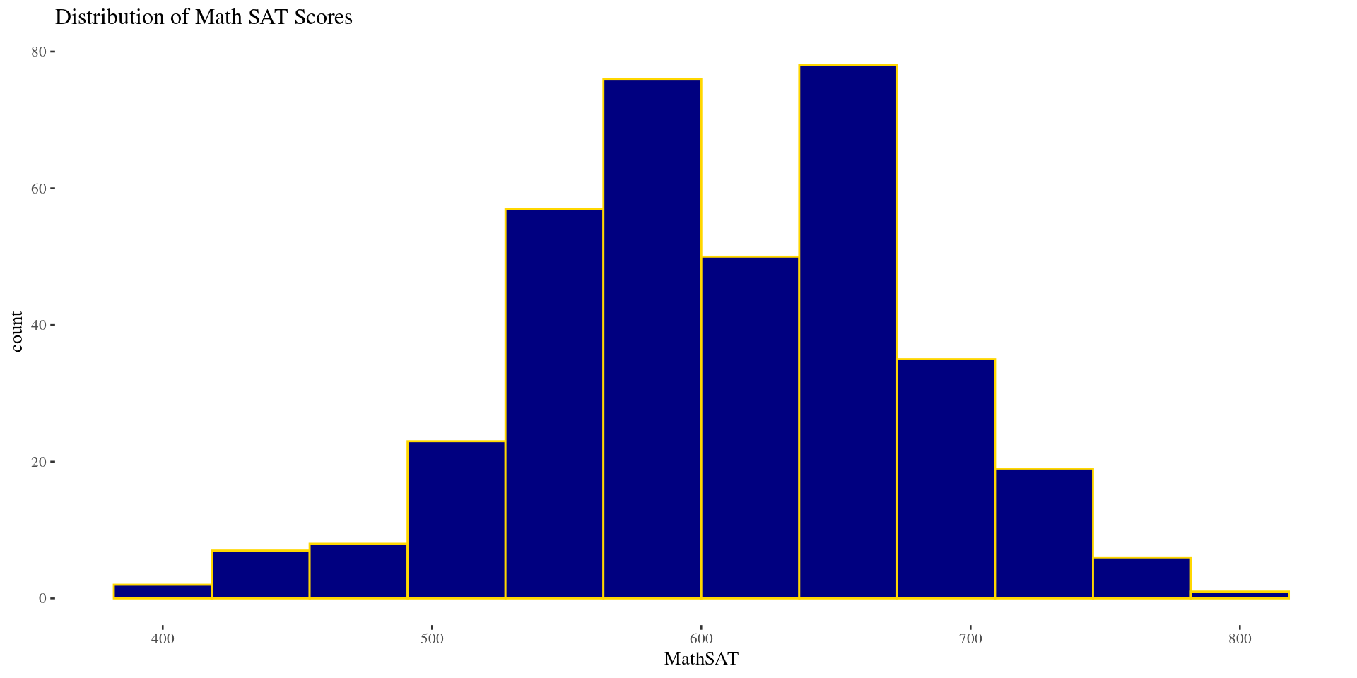
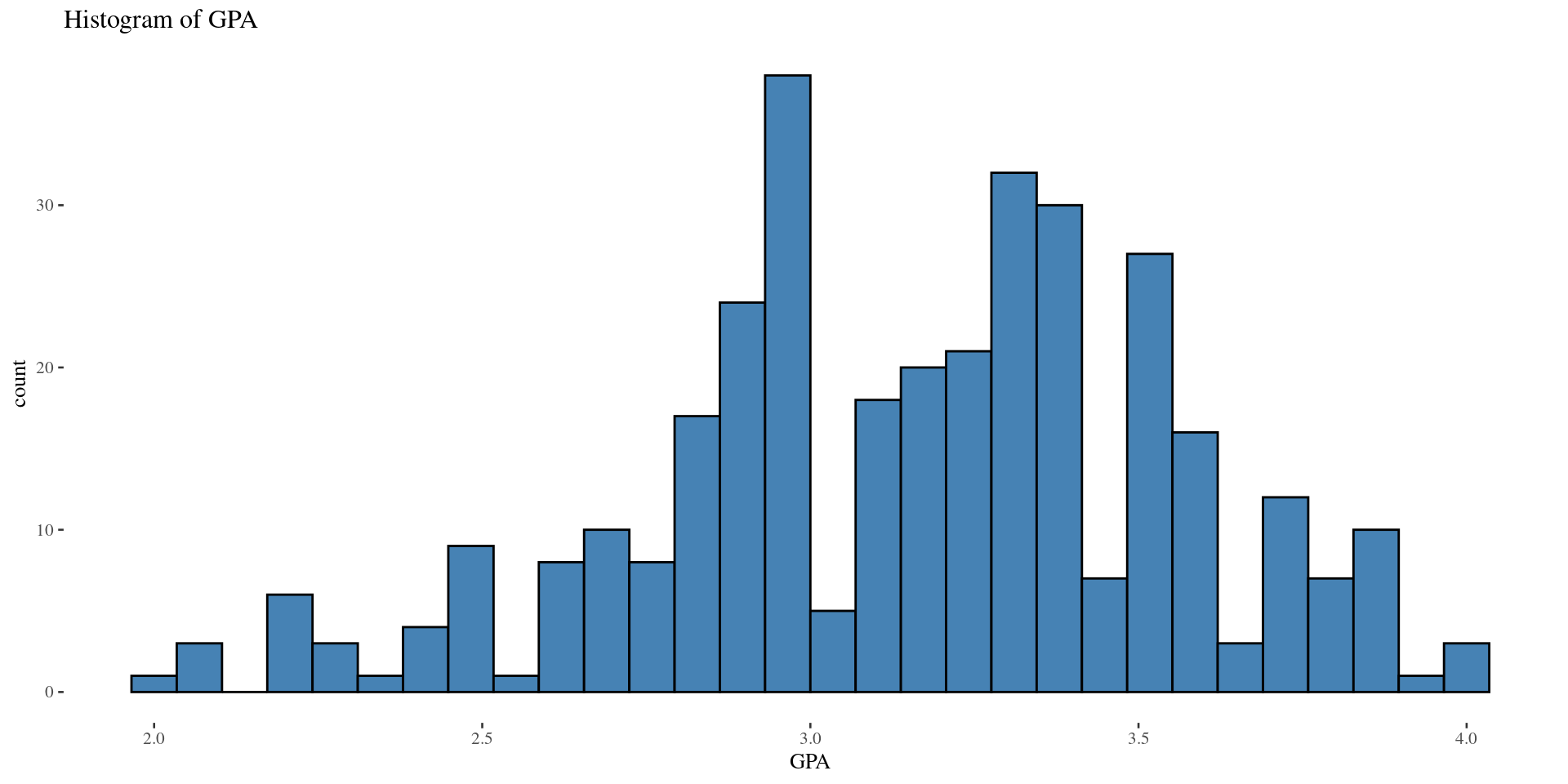
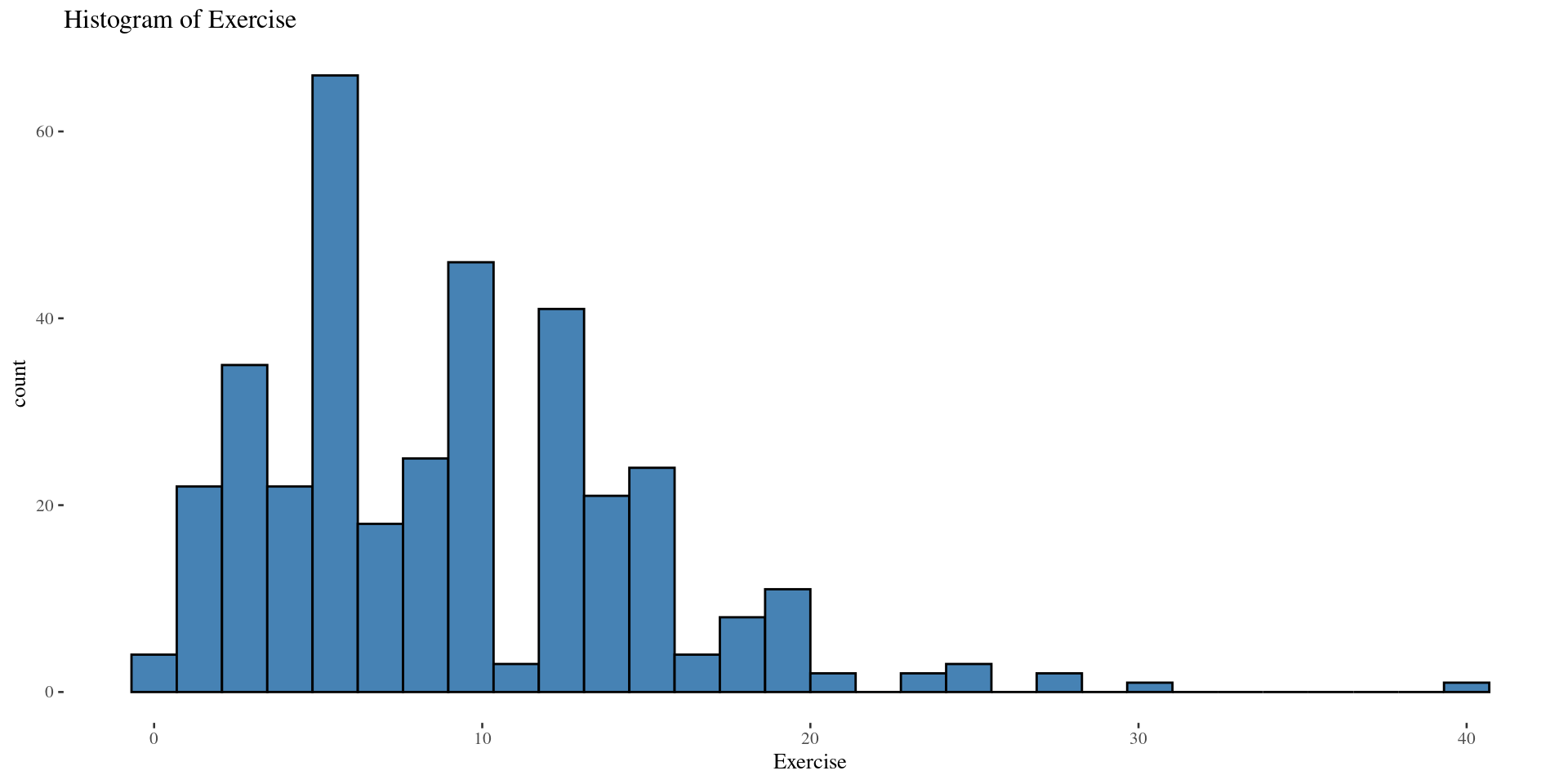
Shape: histogram
Bell-shaped distribution
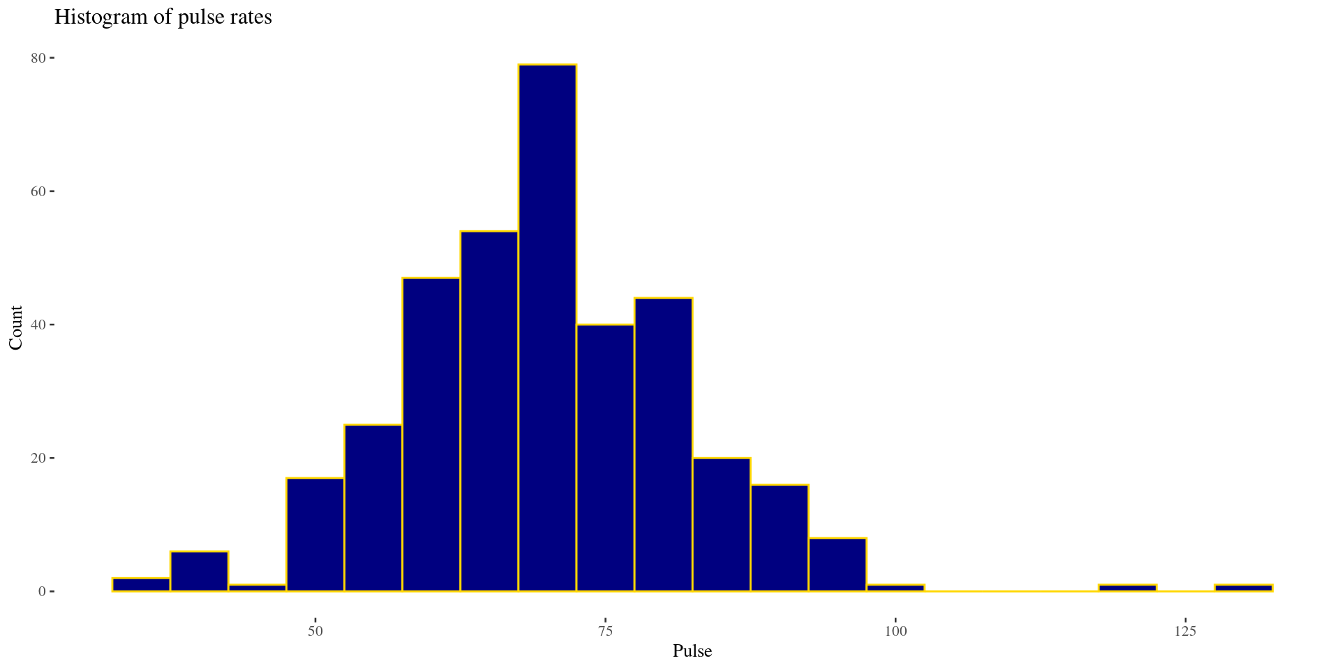
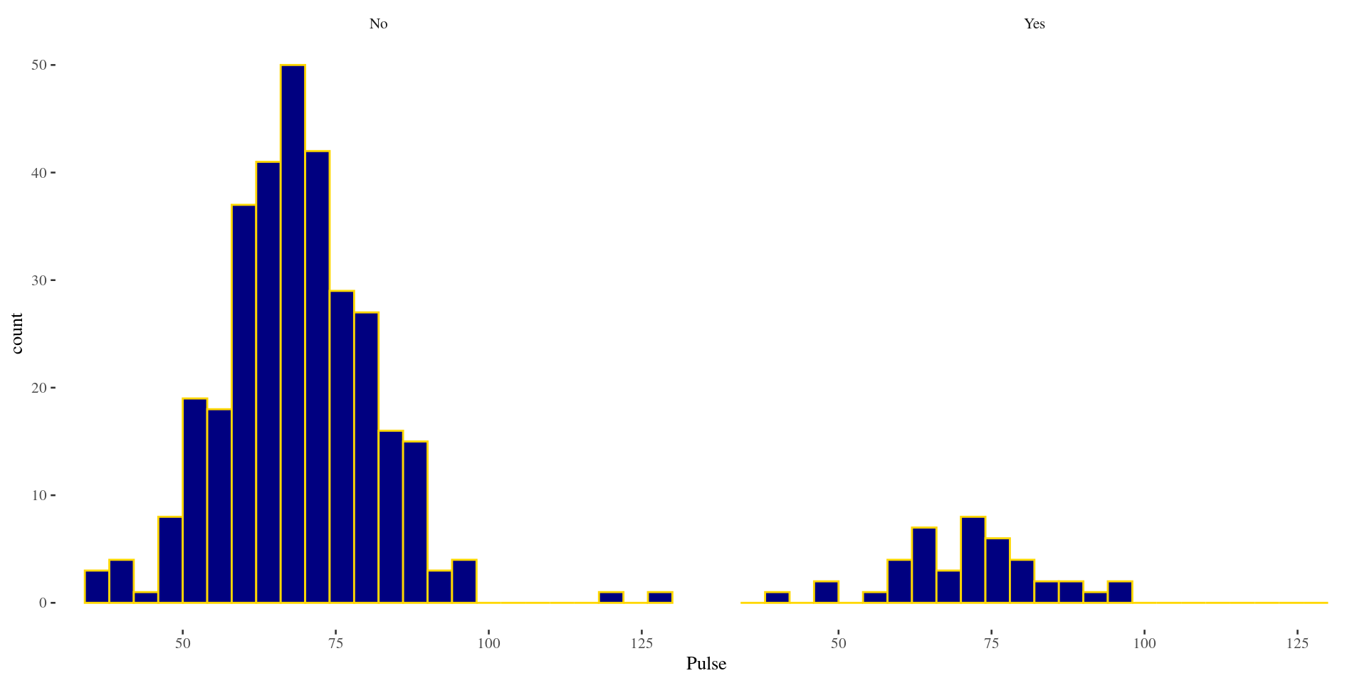
Shape: Left Skew \(\&\) Right Skew (Histograms)
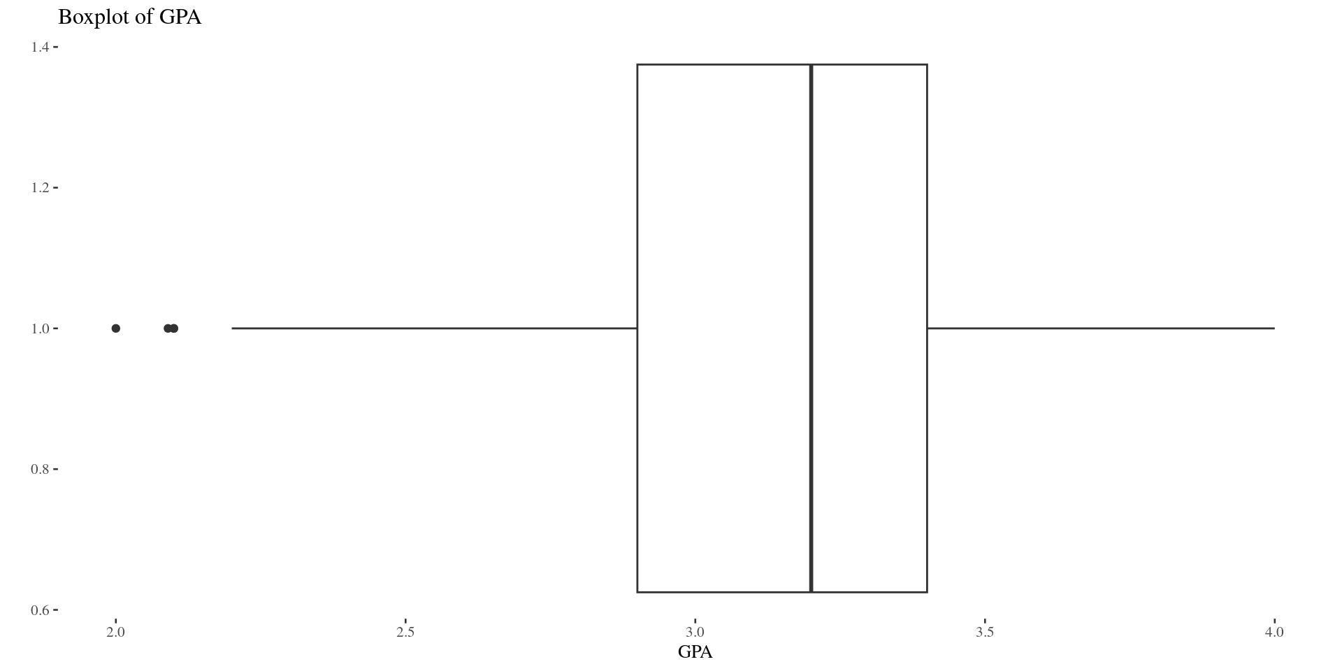
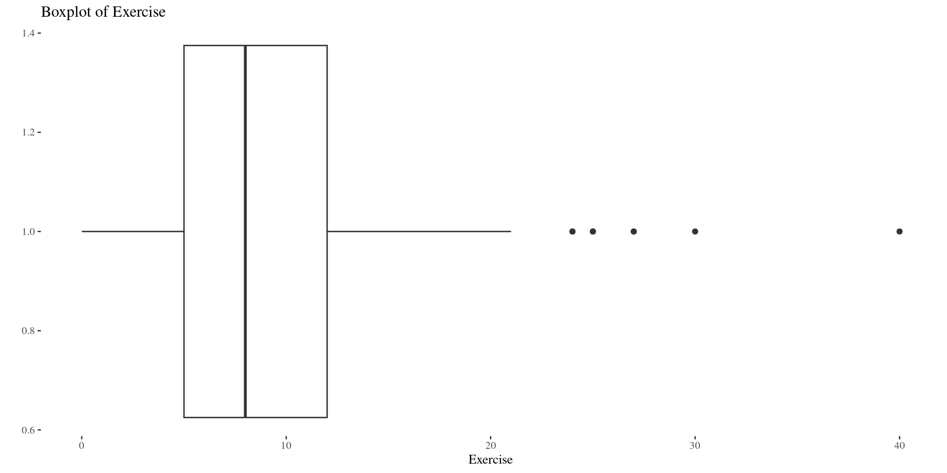
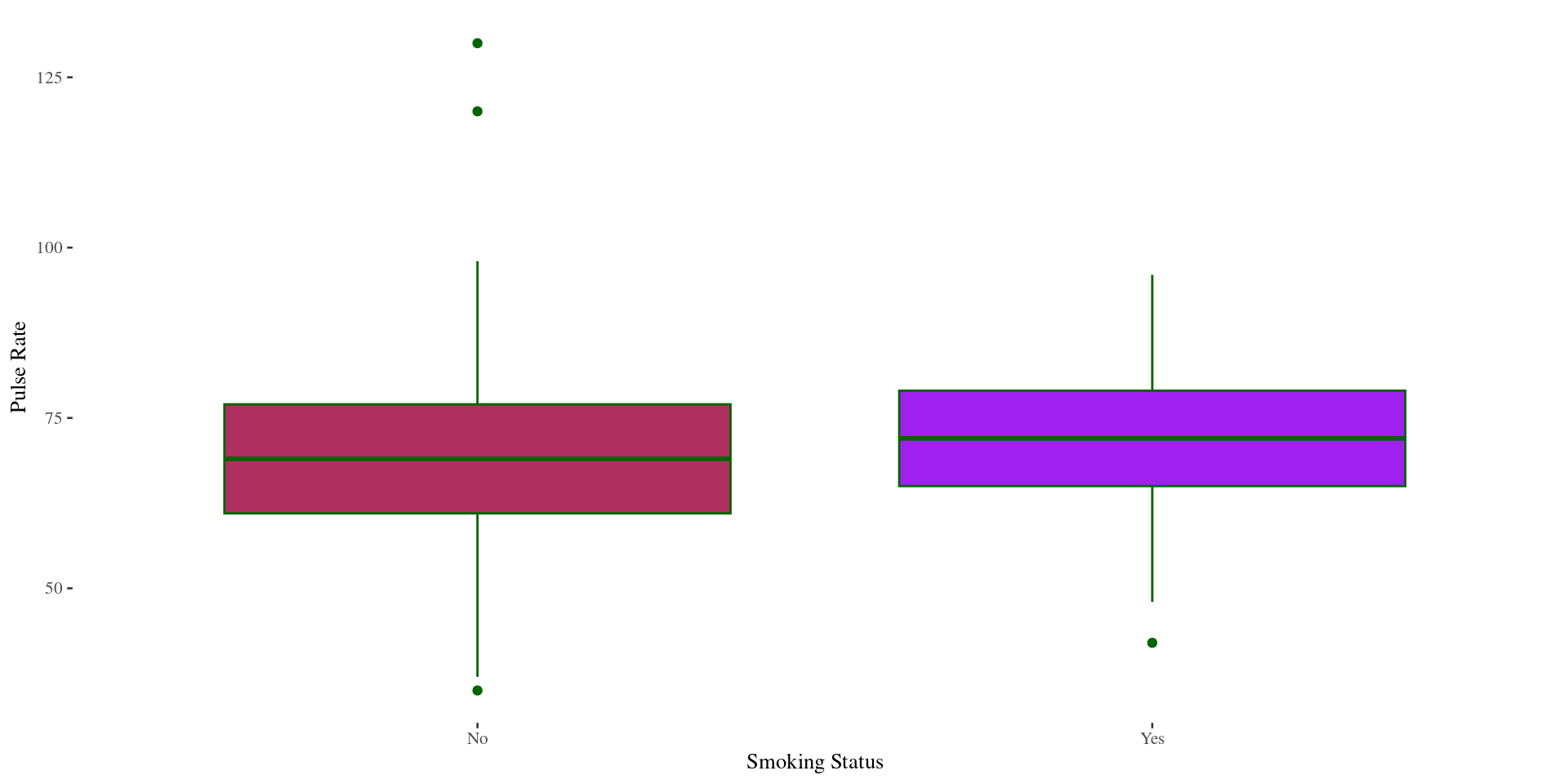
Shape: Left Skew \(\&\) Right Skew (Boxplots)
Histogram
Boxplots
Group Activity 1

- Please download the Class-Activity-5 template from moodle and go to class helper web page
30:00