p.hat <- 1329/2253
p.hat
[1] 0.5898802A 2012 survey of a random sample of 2253 US adults found that 1,329 of them reported using a search engine (such as Google) every day to find information on the Internet.
Answer: \(\hat{p} = 1329/2253\)
p.hat <- 1329/2253
p.hat[1] 0.5898802Let’s visualize the distribution of the sample mean. The following is a vector X containing the \(6\) data points:
X <- c(20, 24, 19, 23, 22, 16) # our dataWe start by creating 500 bootstrap samples from our data. Bootstrapping is a resampling technique where we sample with replacement from the original data, usually the same number of observations as the original dataset, to create ‘new’ samples. This process mimics the sampling variability inherent in collecting data. For each bootstrap sample, we calculate the mean.
bootstrapped_means <- sapply(1:500, function(i) mean(sample(X, replace = TRUE)))

# Or using replicate which is more concise for this case:
bootstrapped_means <- replicate(500, mean(sample(X, replace = TRUE)))

# To get a data frame similar to the tibble you created with purrr:
bootstrapped_means_df <- data.frame(
  iteration = 1:500,
  mean = bootstrapped_means
)
After calculating the bootstrap sample means, we visualize their distribution using a dot plot. This plot will give us a sense of the sampling distribution of the mean - showing us where the mean is most likely to fall and how much it can vary.
library(ggplot2)
ggplot(bootstrapped_means_df, aes(x = mean)) +
  geom_dotplot(dotsize = 0.7,
               stackratio = 0.9,
               binwidth = .13,
               color = "gold",
               fill = "blue") +
  ggtitle("") + xlab("") + ylab("") +
  scale_x_continuous(limits = c(17, 24),
                     expand = c(0, 0),
                     breaks = seq(17, 24, 1)) +
  labs(title = "Bootstrap distribution of sample mean")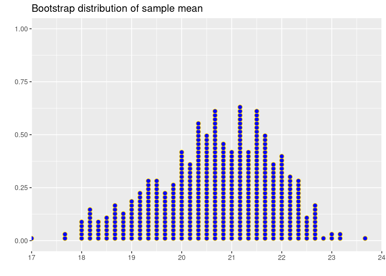
Answer: It’s close.
According to a PEW survey, \(66\%\) of U.S. adult citizens casted a ballot in the 2020 election. Suppose we take a random sample of \(n=100\) eligible U.S. voters and computed the sample proportion who voted.
# Define parameters
pop.prop <- .66 # Population proportion
n.size <- 100  # sample size
Let’s plot this sample proportion in R.
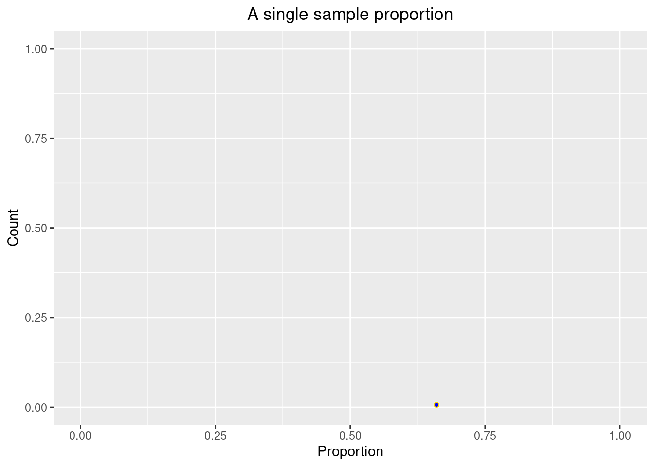
Similarly, we can generate 5 random samples of size \(n= 100\) and plot the sample proportions.
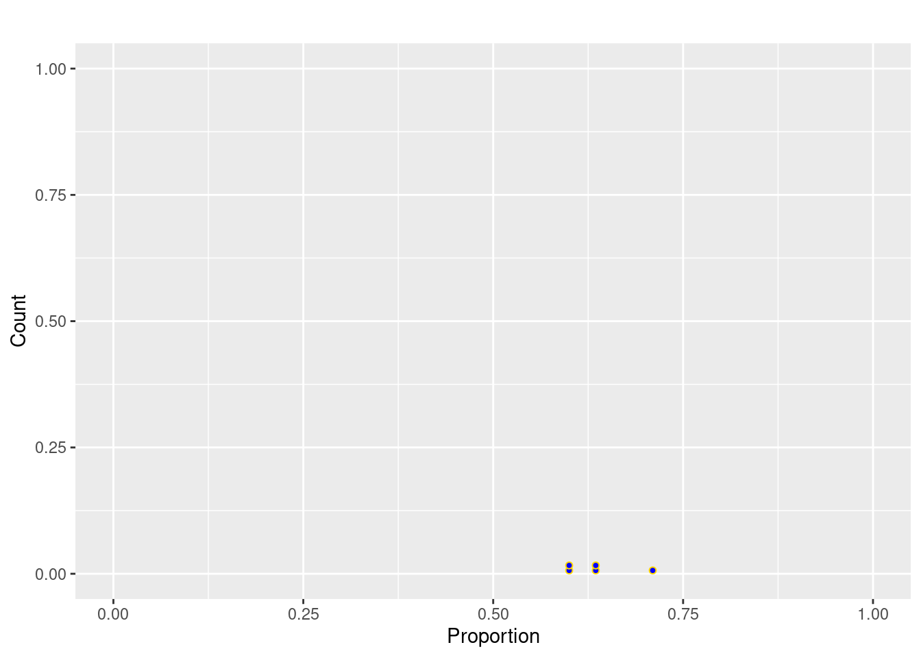
Continuing on, we can generate 500 random samples of size \(n= 100\) and plot the sample proportions.
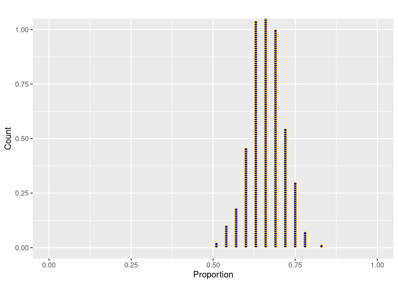
Answer: The center of the distribution is close to 0.66.
mean(sample.prop500)[1] 0.66298Answer: The standard error is close.
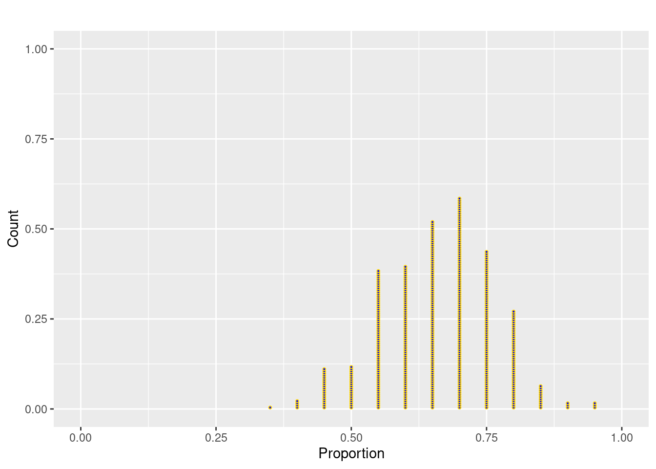
Answer: The shape is slightly left skewed, still centered at 0.66 but with more variability that before (SD of about 0.10). This distribution is more discrete looking because there are just a few sample proportions possible with n=20 (e.g. 20/20, 19/20, 18/20, etc).
mean(sample.prop500_size10)[1] 0.6603sd(sample.prop500_size10)[1] 0.1024202n=20.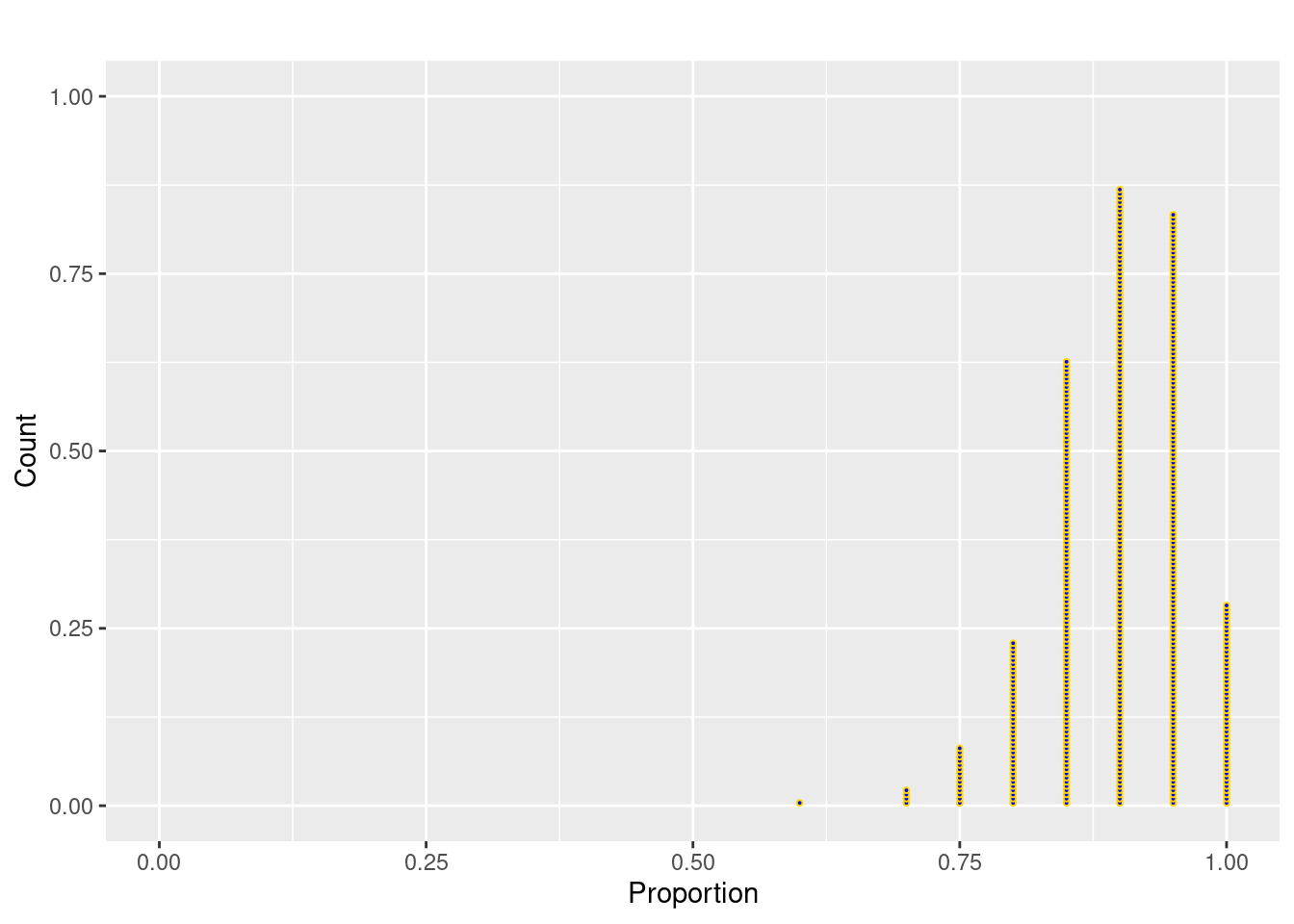
Answer: The shape is much more left skewed than when p=0.66. Center is around 0.90 and SD is around 0.07. Note that increasing the population proportion closer to 1 results in a decrease in the SD because most samples give proportion near 1.
mean(sample.prop500_size10_large_p)[1] 0.8989sd(sample.prop500_size10_large_p)[1] 0.06412499